- Love the Indies
- Posts
- Why Your Zine Colors Look Different from Your Screen
Why Your Zine Colors Look Different from Your Screen
RGB vs CMYK: The Mistake Most Zine Makers Make
Yusuke Nagata
February 12, 2026
You carefully edited the files, exported the PDF, and finally sent everything off to the printer.
But when the printed zine arrived at your home… the colors looked strange. It was darker than expected. The overall quality felt disappointing.
Have you ever experienced that?
Before blaming the printing company, you might need to better understand how to properly prepare your files for print.
This edition will be especially helpful if you’re about to make your first zine — or if you’ve made zines before but always feel unsatisfied with the colors.
Table of Contents
🚨 NEWS: My Contact Sheet Zine Has Surpassed 200 Copies Sold
Thank you so much to everyone who continues to support my work.
My contact sheet zine has now sold over 200 copies. In addition, both 404 NOT FOUND Vol.1 and Vol.2 are officially sold out. That means a total of 650 copies from the 404 series are now out in the world, in someone’s hands.
When I first created the 404 zine, I never imagined it would reach this many people. There are currently no plans for a reprint. To everyone who picked up a copy — thank you, truly.
And if you still haven’t gotten the contact sheet zine, now might be the time.

🎨 Print Basics: Understanding RGB vs. CMYK
Before making a zine, there’s one thing you absolutely need to understand: the difference between RGB and CMYK.
Most of us edit our photos on a computer. On your screen, colors are displayed in RGB (Red, Green, Blue) — the additive color system based on light.
Because screens emit light, they can display vibrant, glowing colors — even neon-like tones — beautifully.
On the other hand, when you print a zine (or anything on paper), colors are created using CMYK — Cyan, Magenta, Yellow, and Black ink.
To be honest, you don’t need to get overly technical about RGB this and CMYK that.
The only thing you really need to remember is this:
Screens create color with light (RGB).
Paper creates color with ink (CMYK).
That’s the fundamental difference.

When you layer light, it becomes brighter — eventually turning white. When you layer ink, it becomes darker — eventually turning black.
Because of this difference in how color is created, the range of colors (color gamut) that ink can reproduce is narrower than what light can display.
That’s why the colors you see on your screen will almost never look exactly the same once printed.

But don’t panic.
Once you understand how ink behaves, you can prepare your files properly for print — and get much closer to the result you want.
🧑💻 How I Edit My Photos for Zine Printing
Let me walk you through how I prepare image files for my zines.
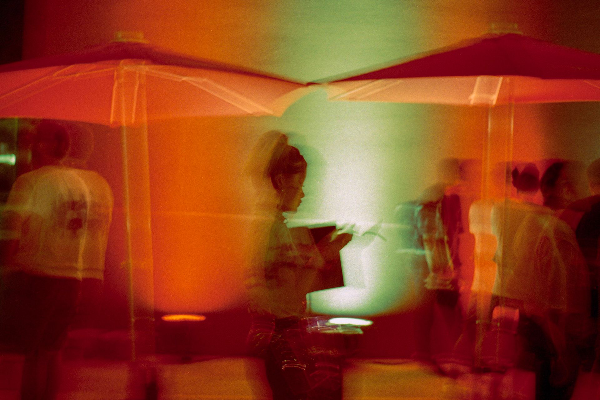
I’ll use this photo as an example. It’s a shot I took at an event — a woman smoking, captured in profile. I loved how the background was lit in orange and green. The artificial light created a really beautiful contrast.
But if I printed this photo exactly as it looks on screen, those colors would lose their magic.
I haven’t actually printed this exact original file, but based on experience, I can already predict what would happen:
The orange would likely turn dull and muddy, and the shadows would block up, making her expression harder to read.
That would completely ruin the night atmosphere I’m trying to convey.

Photos like this — especially ones lit by artificial night lighting — are extremely difficult to reproduce accurately in print.
Just remember this:
Print will almost always look darker than your screen.
Paper doesn’t emit light. It reflects ink.
So when I prepare files for print, I often push the vibrancy and brightness further than feels “correct” on screen. Sometimes it even looks slightly overdone on my monitor — but that’s intentional.
Let’s look at the actual process.
Adjusting Saturation and Luminance in Lightroom (Color Mixer)

First, I adjust the main color — in this case, orange.
To prevent it from turning muddy in print, I go into Lightroom’s Color Mixer and tweak the Saturation and Luminance of the orange channel. I increase both slightly to make the color brighter and more vibrant.
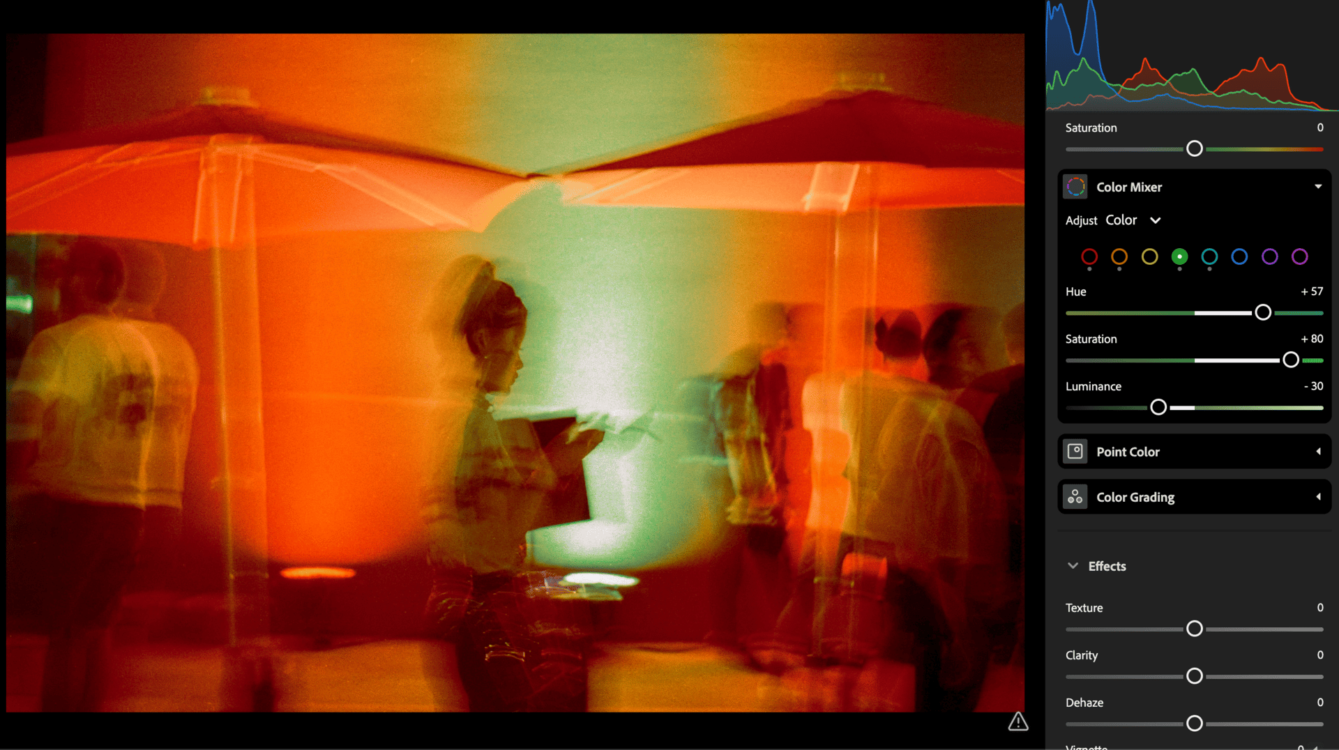
Then I move on to the secondary color — green — and adjust it in the same way using the Color Mixer.
Lifting the Shadows in Lightroom

Shadows are another problem area in print.
Shadows don’t reproduce the same way in print as they do on screen. That’s why I lift the shadows in Lightroom to make the overall image brighter before sending it to print.
Final Color Adjustments

Adjusting the shadows slightly reduced the vibrancy of the green areas, so this time I tweaked the Tint just a bit to bring it back.
After printing over and over again, I’ve learned that greens like this are especially difficult to reproduce accurately in print.
🔥 The Final Print-Ready File
Here is the final print-ready version of the image after editing.
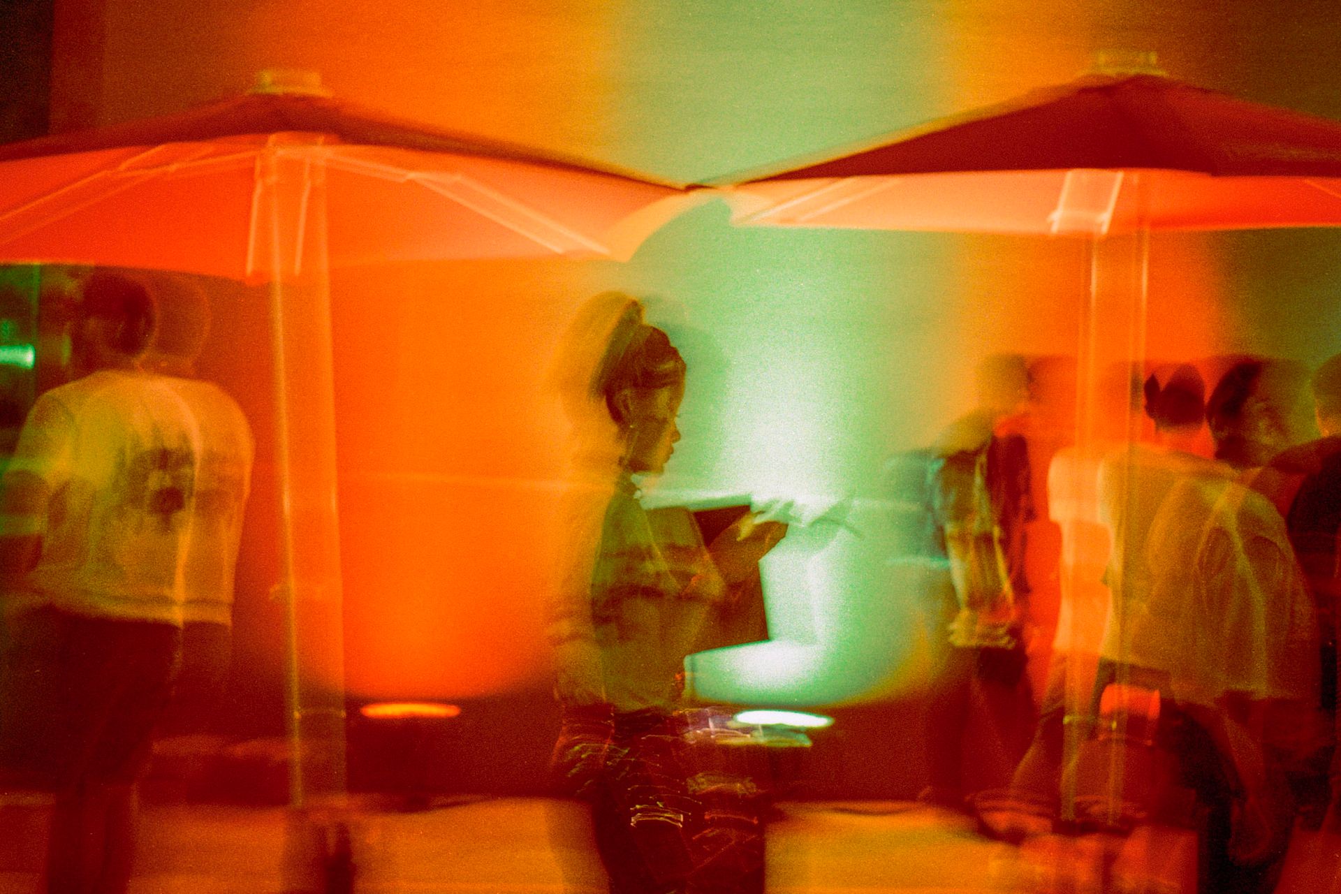
Print-Ready File
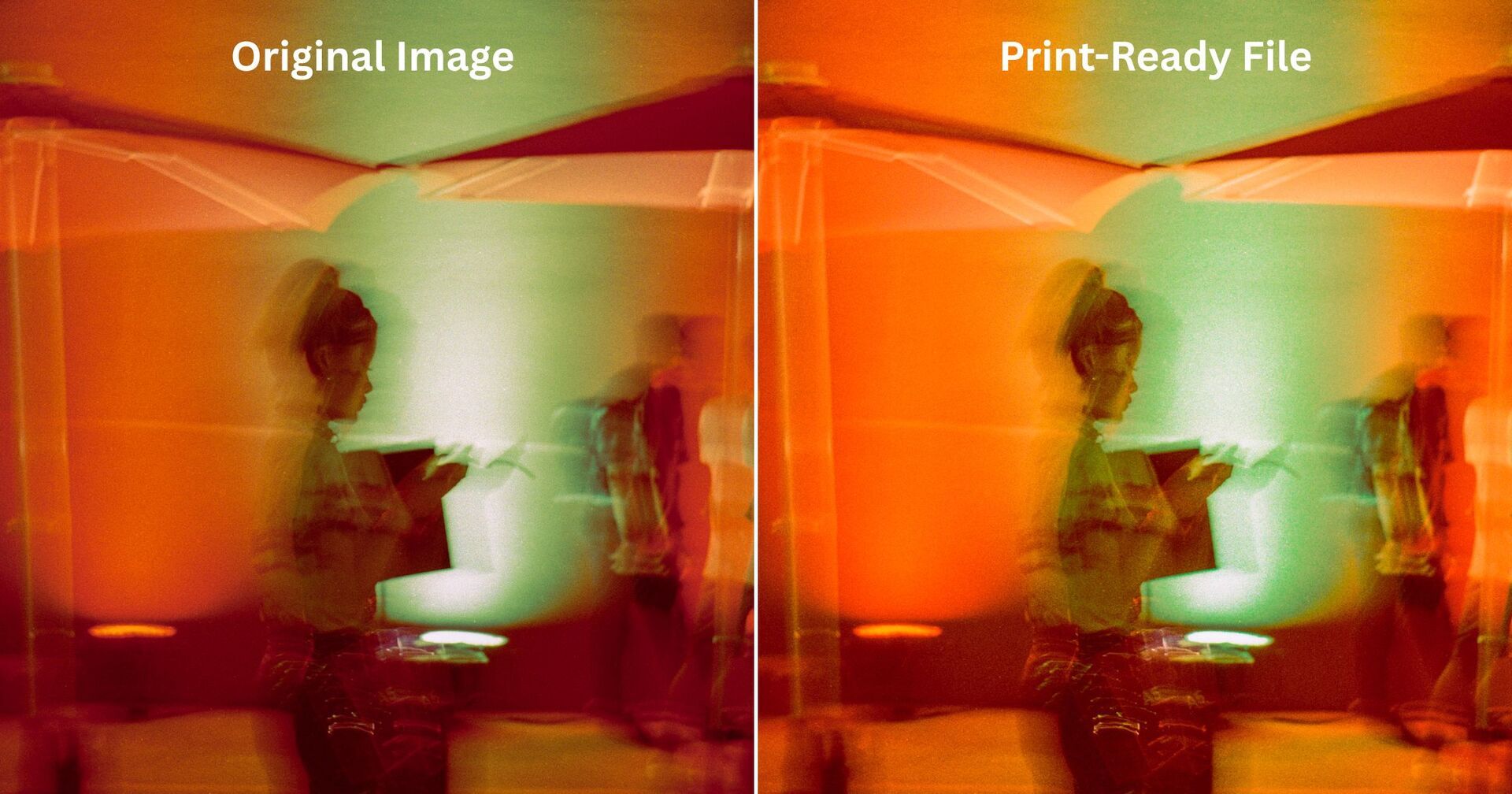
Of course, this comes down to personal preference — and honestly, on screen I still prefer the original photo. The colors feel richer and more natural.

Original Image
But when you compare them side by side, the difference becomes clear. The print-ready version is brighter, and the shadow areas are more visible and defined than in the original.
Editing every single image like this might feel tedious. But there’s nothing worse than receiving a box full of freshly printed zines — only to realize you’re not happy with how the photos look. Trust me. It’s worth the extra effort. Give it a try.
That said, even after making these adjustments, it doesn’t guarantee the colors will turn out exactly how you imagined. Instead of printing 50 or 100 copies right away, start with just one copy — or even just a few selected pages as a test print — and check the colors carefully.
And don’t forget: when exporting your PDF, make sure to set the color mode to CMYK, not RGB.
If you have the time and budget, repeat this test process. Refine it step by step until you arrive at the version that truly satisfies you.
Also, keep in mind that this workflow is simply how I approach making zines. If you’re planning to produce a full-scale photobook, I strongly recommend working directly with a professional printing company and going through proper color proofing with them.
If you have your own tips for preparing print files, feel free to share them in the comments. I’d love to hear your process.
See you next time!
🏫 A Photobook Documenting High School Life on a Nikon EM — Now Available at FED
If I had owned a camera during my high school years, I definitely would have documented everything.
Photos from your student days can only be taken during that time in your life — the after-school moments spent doing nothing with classmates, the friends who make funny faces the moment a camera points at them, the sports events, the small everyday scenes that now feel deeply nostalgic.
Hajime is 18 years old. He created a photobook titled A RUDE AWAKENING, documenting his own high school life.

This book is his debut publication, produced as a hardcover edition using money he had saved since childhood from otoshidama — the Japanese New Year tradition where children receive small cash gifts from their families. By investing those personal savings, he chose to turn his first body of work into a physical book.
He is now studying photography at university, continuing down this path.
His debut work is now available at FAR EAST DARKROOM.
A rare book you won’t easily find elsewhere — make sure to check it out.
🦖 Come hang out with me on Instagram → @_nuts.tokyo_
🪐 New videos on zines & photography up on YouTube
🧃 Curious about Japanese and Asian zines? Visit FAR EAST DARKROOM.
Reply