Creativity starts with curiosity.
This time, I tried something a little wild—I toned one of my darkroom prints with matcha.
In darkroom printing, it’s pretty common to tone prints with coffee or tea, but I started wondering—what would happen if I used matcha instead? I drink it all the time, so I figured, why not experiment? The result turned out amazing.
Hope you stick with me ‘til the end!
Shoutout to Everyone Who Pre-Ordered—Couldn’t Have Done It Without You

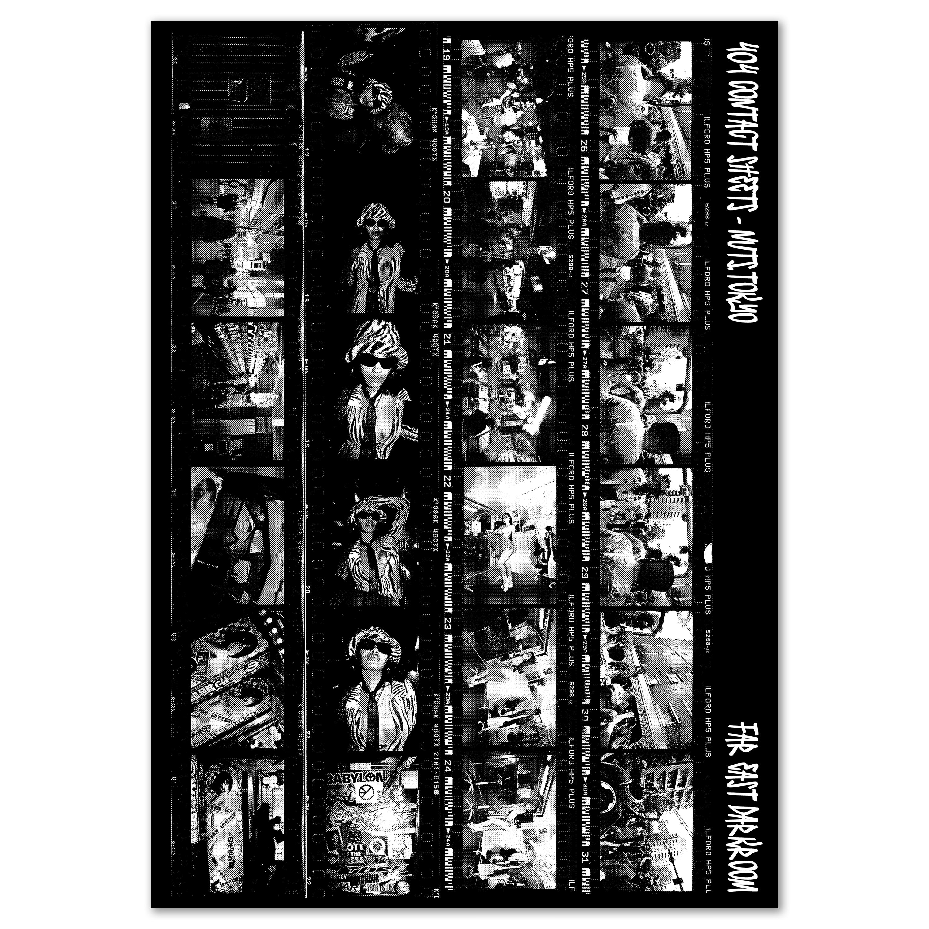
On May 14, I closed pre-orders for my latest zine, 404 CONTACT SHEETS. I was blown away by how many of you placed an order—thank you so much.
I’ve just finished pasting the darkroom prints into each zine, and shipping will start tomorrow (some are already on their way). Hang tight until yours arrives!
Also, regular orders are now open. If you’re curious, go check it out—at 116 pages, it’s a hefty one. I think you’ll love it. Click here for more info.
Toning a Darkroom Print with Matcha
Remember the double exposure I shared on Instagram? It was a woman in a kimono overlaid with cherry blossoms. This time, I printed that image.

I used ILFORD MULTIGRADE FB CLASSIC paper.
For those not familiar with darkroom printing—there are two main types of paper: RC and fiber-based. Fiber paper is known for its ability to render rich, deep blacks in a way that RC paper and even high-end inkjet paper can’t quite match.
ILFORD’s FB Classic is a fiber-based paper, and it’s already beautiful on its own. But precisely because prints are physical objects, I wanted to try a physical, tactile kind of editing—something that only analog allows.
That’s when I thought: what if I toned it with matcha, the kind I usually drink?


*Matcha powder tends to clump, so I used a traditional chasen (bamboo whisk) to mix it with hot water.
Pouring Matcha After the Usual Darkroom Process
The process itself is pretty straightforward. After going through the usual darkroom steps—developing, stopping, fixing, and washing—I poured the matcha into a tray.
At first, I wasn’t sure how long to let the print soak. I tried about 15 minutes, but there wasn’t much of a difference. So I decided to leave it for over an hour instead.

You might expect the result to turn the print slightly green—but the outcome was quite different from what I imagined.
A Warm Tone Like Traditional Washi Paper
After soaking the print in matcha for an hour, I gave it a final wash, dried it, and flattened it. Here’s the finished result.

It turned out beautiful.
Combined with the image of the woman in a kimono and the cherry blossoms, the tone ended up resembling traditional washi paper, with a subtle warmth that felt deeply Japanese.
This particular print is 11x14”, and when compared to the untoned 8x10” version, the difference becomes clear.

The untoned print has a crisp, clean white. It’s beautiful as is—but the matcha-toned version shifts toward a soft sepia.
That added warmth brings a new sense of depth and dimension to the image, making it feel more three-dimensional and immersive.

Creating prints like this is just so much fun.
I get excited thinking about my photos not just being consumed as digital files, but existing as physical objects in the real world.
And when one of those prints ends up in someone’s hands—hung on their wall, becoming a part of their daily life—that’s what truly makes me love making prints.
I encourage you to try experimenting with toning, too—there’s a whole world to explore.
By the way, this particular print is available as part of the 404 CONTACT SHEETS print set, limited to just 10 copies. A few have already been claimed, so if you’re interested, don’t wait too long.
That’s it for this week’s edition. See you next time!